This option is used to make changes to the view settings for views in the project. The View Properties panel is an option for Plan, Section and Perspective views in 12d Model.
Continue down the page to see the View Properties Panel options.
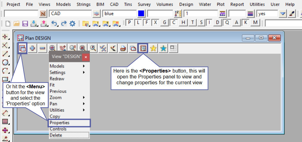
To view the View Properties Panel use the button on the view toolbar, below it is shown on the Plan View Toolbar.
The other way to find the View Properties panel is to use the view
Plan View Menu => Properties option.
‘General’ Properties
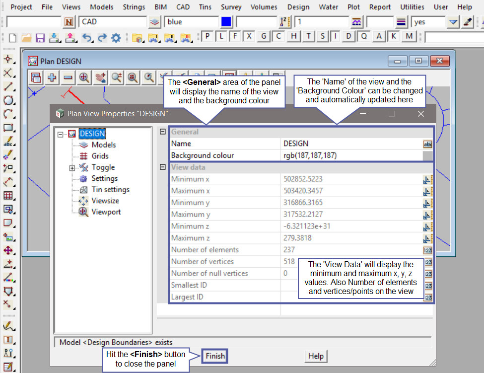
When the ‘View Properties panel is opened, the General Information is displayed.
The ‘General’ area has the ‘View Name’ and ‘Background Colour’, these two options can be modified and the updates will be automatically made to the view. For the ‘View Name’, just highlight the current name and then type in the new view name and hit the <Enter> button to confirm. To change the ‘Background colour’ of the view hit the <Colour> button and select a colour from the drop down list.
The ‘View Data’ area has the details of the view extents, minimum and maximum x, y and z values for the data that is turned onto the view. Also the ‘Number of elements’, ‘Vertices/Points’ of the data on the view.
Hit the <Finish> button to close the panel.
‘Models’ Properties
Select the ‘Models’ from the LHS tree structure, the details of the models that are currently turned onto the view are listed on the RHS of the panel, under ‘Models on View’. There is also a list of the models that are not currently turned onto the view, but they are available to be added to the view.
The four buttons that are in between the 2 model lists are options for adding and removing the models from the current view.The buttons are:
- Top Button = <Add All to View> This will add all the remaining models to the view.
- Second Button = <Add to View> This will add all the selected model/s to the view. Either select one model at a time or highlight multiple models to add to the view.
- Third Button = <Remove All from View> This will remove all the models from the current view, no models will remain on the view.
- Bottom Button = <Remove from View> This will remove all the selected model/s from the view. Either select one model at a time or highlight multiple models to remove from the view.
The buttons on the RHS of the panel are for sorting the model draw order, the model at the top of the list will be drawn on the view first, and the last model in the list will be drawn last, ie it will sit on top of all the models. An example would be a raster image, it is best to have it drawn first on the view so that the model strings can be seen on top of the raster.
The five buttons are :
- Top Button = <Sort Alphabetically> This will sort all the models on the view alphabetically.
- Second Button = <Move to Top> This will move the selected model/s to the top of the list. Either select one model at a time or highlight multiple models to move them up to the top of the list.
- Third Button = <Move Up> This will move the selected model/s up one place in the list.
- Fourth Button = <Move Down> This will move the selected model/s down one place in the list.
- Bottom Button = <Move to Bottom> This will move the selected model/s to the bottom of the list. Either select one model at a time or highlight multiple models to move them down to the bottom of the list.

‘Grids’ Properties
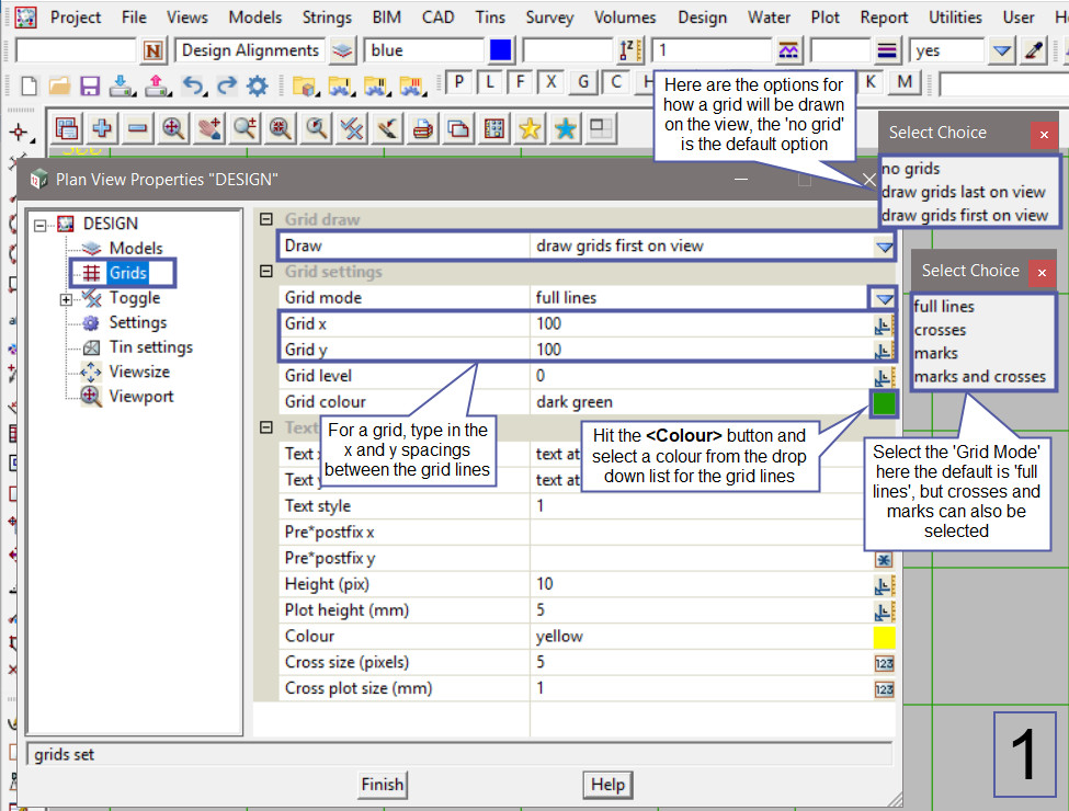
Select the ‘Grids’ from the LHS tree structure, the grid properties will allow the user to decide if a grid is to be turned onto the view. The ‘Grid Draw’ options available on image No.1 are:
- No Grids – No grid on the view.
- Draw Grids Last on View – The grid will be draw with the properties last on the view, basically it will sit on top of the models in the draw order.
- Draw Grids First on View – The grid will be draw with the properties first on the view, basically it will sit below the models in the draw order.
The ‘Grid Settings’ options are the settings for the grid lines and grid text and they are:
- Grid Mode –
- Full Lines – Solid lines drawn at east (x) and north (y) spacing.
- Crosses – Crosses drawn at the intersection of the grid east (x) and north (y) spacing.
- Marks – Marks are small lines drawn at the beginning and end of grid x and y spacing, ie there are no lines or crosses over the view, only on the top, bottom and sides of the view.
- Marks and Crosses – Marks and Crosses are drawn as per the option explained above.
- Grid x and y Spacing – The grid will be drawn at the spacings typed into the panel, the default values are 100m spacings.
- Grids Level – The grid is set in a constant z value, if a value is set it will only be used for a perspective view.
- Grid Colour – Hit the <Colour> button and select a colour from the drop down list.
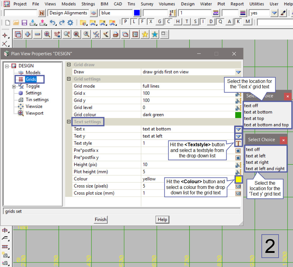
The ‘Grid Draw’ options available on image No.2 are:
- Text x and Text y – Select from the drop down list the location of where the text is to sit in relation to the grid lines.
- Textstyle – Hit the <Textstyle> button and select a textstyle from the drop down list.
- Pre* postfix x and y – a Prefix or Postfix can be applied to both the text value of the x and y grid text. ie E*m would place an E before the x value and m after the x value.
- Text Height (pix) – The height of the grid text in screen pixels for displaying the grid text on the view.
- Text Plot Height (mm) – The height of the grid text in millimetres for plotting purposes.
- Text Colour – Hit the <Colour> button and select a colour from the drop down list.
- Cross Size (pixels) – The size of the grid crosses in screen pixels for displaying the grid crosses on the view.
- Cross Plot Size (mm) – The size of the grid crosses in millimetres for plotting purposes.
‘Toggle’ Properties
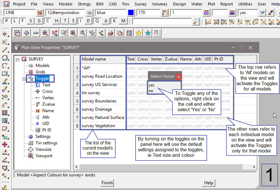
The ‘Toggle’ properties relates to the options that can be toggled (turned on and off) on the selected view. These could be point crosses, string names, z-values etc. For the ‘Toggle’ setting on image no.1:
Selecting the ‘Toggle’ option on the LHS tree structure, will display the list of the current model/s on the view, along with an ‘All’ option at the top row which relates to all the model/s on the view. By toggling on the toggles here, the default setting (text size, colour, cross size etc) will be used. To toggle these option on, select the cell, ie the ‘All’ row and z-value, then right click and select the ‘Yes’ option. All the z-values should then be toggled onto the view.
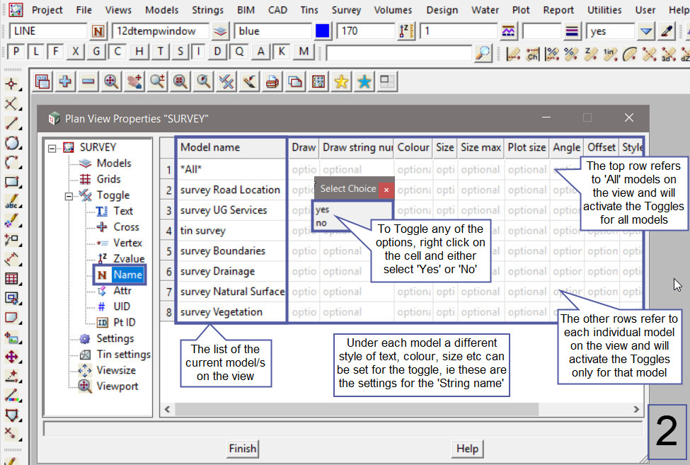
To change the default settings for displaying the toggles, they are set on the individual parts of the panel, ie hit the <+> button beside Toggle in the tree structure. The setting s for the ‘Name’ or string name are shown on image 2:
Under each option the panel will display the list of the current model/s on the view, along with an ‘All’ option at the top row which relates to all the model/s on the view. By toggling on the toggles here, in the first column ‘Draw’ will turn the toggle on, the following columns will allow users to set the settings for the toggle, ie the colour, size, angle and style of text to name a few.
To set the toggle settings either right click or if no option appears, then type in the value required. The view will be automatically updated as changes are made, and if the toggle is no longer required, then right click on the first column and change the choice to ‘No’.
‘Settings’ Properties
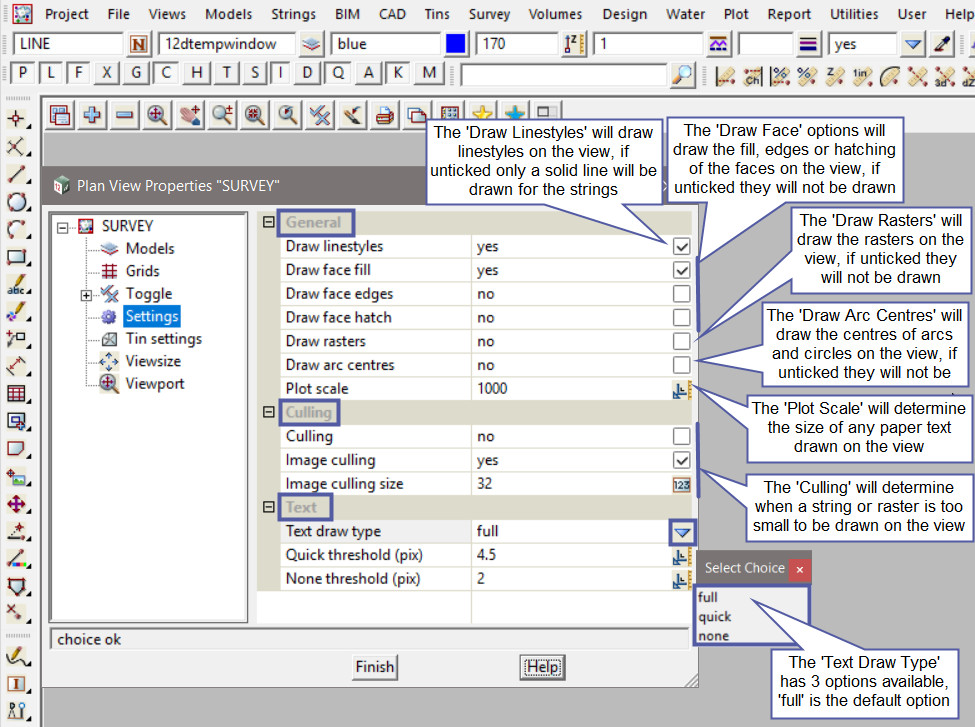
The ‘General’ properties relates to different settings for displaying options:
- Draw Linestyle – if ticked the linestyles will be drawn on the view, if unticked all line strings will be drawn as a solid line (linestyle 1), and point strings will only have crosses at their points.
- Draw Face Fill – if ticked the face fills will be drawn on the view in their fill colour, if unticked the face fills will not be drawn.
- Draw Face Edges – if ticked the face edges will be drawn on the view, if unticked the face edges will not be drawn.
- Draw Face Hatch – if ticked the face hatching will be drawn on the view in their hatch pattern, if unticked the face hatch will not be drawn.
- Draw Rasters – if ticked any rasters on the view will be drawn, if unticked any rasters turned onto the view will not be displayed.
- Draw Arc Centres – if ticked the centres of any arcs and circles on the view will be drawn as a point, if unticked the centres of the arcs and circles will not be displayed.
- Plot Scale – the scale that is entered here will determine the size to draw any paper text on the plan view.
The ‘Culling’ options are used to suppress the drawing of strings whose on-screen extent is less than a user defined pixel size. So if culling is ticked, any strings whose extent becomes smaller than 10 pixels (default value), the strings will disappear from the view. The same will happen to images when their extents become smaller than 32 pixels (default value), the image will disappear from the view too.
The ‘Text’ options allow the user to specify how text is displayed in the plan view and any plan view plots. For world text there are two text threshold values (quick and none), when the screen size of the text drops below the threshold, the mode of display is automatically adjusted. Basically as the text gets smaller on the screen it can be automatically drawn as ‘quick’ text or no text at all – ‘none’.
All Text is tested against the ‘None’ threshold , and if it does not apply the text characters are not drawn and the whole text string is replaced by a three sided box to indicate where the text is. If the text passes the quick and none thresholds the text is drawn in full. The thresholds are set in pixel heights.
‘Tin Settings’ Properties
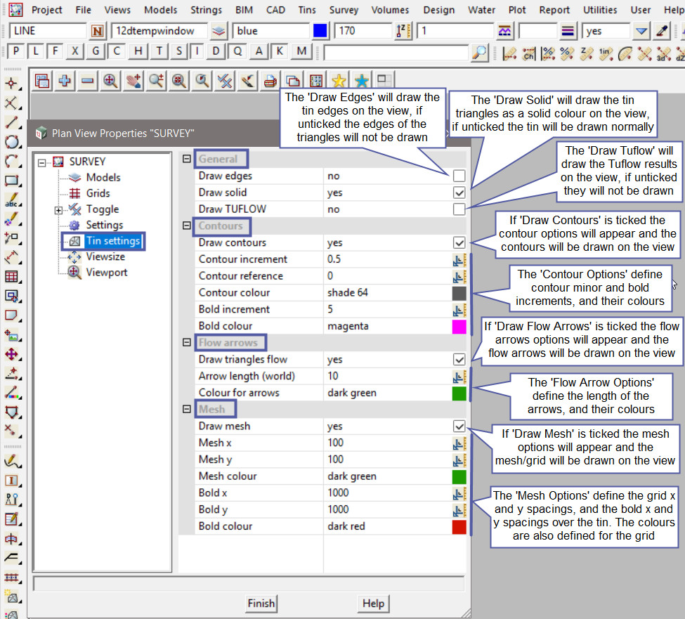
The ‘Tin Settings’ properties relates to different toggle settings for displaying options like:
- Tin Edges – if ticked the triangle edges will be displayed for any tins added to the view.
- Tin Solid – if ticked the tin triangle will be displayed as a solid flat surface for any tins added to the view.
- Tin Contours – if ticked the tin contour settings will be displayed. The colour and increment of the contours can be modified for any tins added to the view.
- Tin Flow Arrows – if ticked the tin flow arrows will be displayed. The colour and arrow length (in world units) can be modified for any tins added to the view.
- Tin Mesh – if ticked the tin mesh will be displayed. The colour and mesh/grid dimensions can be modified for any tins added to the view.
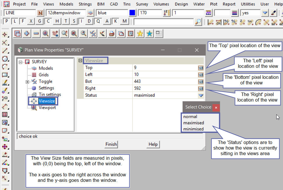
‘Viewsize’ Properties
The ‘Viewsize’ properties will display the size of the view. The Viewsize fields are measured in pixels, with (0,0) being the top left of the window. The x-axis goes to the right across the window, and the y-axis goes down the window.
The options are:
- Top – The pixel location for the top location of the view, in the view area.
- Left – The pixel location for the left location of the view, in the view area.
- Bottom – The pixel location for the bottom location of the view, in the view area.
- Right – The pixel location for the right location of the view, in the view area.
- Status – Is a choice box and will show the current status of the view, whether it is, normal (neither maximised or minimised), maximised, or minimised.
‘Viewport’ Properties
The ‘Viewport’ properties will display the minimum and maximum x coordinates and the minimum and maximum y coordinates for the view.
The options are:
- Minimum X – The minimum x coordinate for the view.
- Maximum X – The maximum x coordinate for the view.
- Minimum Y – The minimum y coordinate for the view.
- Maximum Y – The maximum y coordinate for the view.
- Rotate Angle – Is the rotation angle that the view has been rotated by.

